


http://forums.warriorsworld.net/main/msgs/2683119.phtml
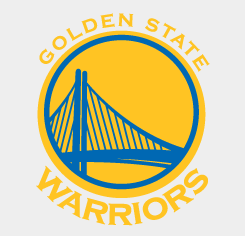
I'm liking our new Warriors logo, it incorporates a nod to the past & the new Bay Bridge. Pretty cool. I also like the "new" Jazz logo. I don't see too much different in the other logos though. someone on another forum pointed out that the ball rotation on the Clips logo was different.
Results 1 to 15 of 25
-
05-07-2010, 07:02 PM #1I Still Believe

- Join Date
- Feb 2008
- Location
- Planet Deto
- Posts
- 184
 Some new NBA logos for the 2010-2011 season
Last edited by detotronix; 05-07-2010 at 07:05 PM.
-
05-07-2010, 07:06 PM #2Shit just got serious
- Join Date
- Jul 2009
- Posts
- 12,324
Re: Some new NBA logos for the 2010-2011 season
That GSW logo is disgusting...

-
05-07-2010, 07:06 PM #3Canned
- Join Date
- Mar 2008
- Posts
- 21,965
Re: Some new NBA logos for the 2010-2011 season

looks like the clippers ball just came from a brick `
`
-
05-07-2010, 07:24 PM #4Knicks 2015 Champs
- Join Date
- Jun 2009
- Posts
- 5,613
Re: Some new NBA logos for the 2010-2011 season
i like them all except the warriors one.... that said, i love the color scheme GSW
-
05-07-2010, 07:25 PM #5King Heno
- Join Date
- Jul 2006
- Location
- Tucson/520!
- Posts
- 22,755
Re: Some new NBA logos for the 2010-2011 season
I don't get the major change in the Clippers one, but have heard that new jerseys will be revealed as well, guess I'm going to wait for those.
-
05-07-2010, 07:30 PM #6Learning to shoot layups
- Join Date
- Mar 2010
- Posts
- 83
Re: Some new NBA logos for the 2010-2011 season
Orlandos logo now is probably my favorite in the league there downgrading in my opinion
-
05-07-2010, 07:41 PM #7Canned
- Join Date
- Mar 2008
- Posts
- 21,965
Re: Some new NBA logos for the 2010-2011 season
 Originally Posted by Azizi

its probably time for a change... the font type just reminds me of the shaq days in the earlier years of the magic organization.
-
05-07-2010, 09:12 PM #8Banned
- Join Date
- Jun 2009
- Posts
- 6,677
Re: Some new NBA logos for the 2010-2011 season
I don't see the difference other then Utah, Orlando and San Fran.
-
05-07-2010, 09:22 PM #9New Uni's 2010-2011
- Join Date
- Jul 2006
- Location
- Utah
- Posts
- 1,097
Re: Some new NBA logos for the 2010-2011 season
what is their source? i couldnt find it. If these are indeed true. Utah's color scheme reminds me quite a bit of the old timberwolves. with the blue and green. Really interested in seeing the new jerseys for next year.
Last edited by New Jazzy Nets; 05-07-2010 at 09:32 PM.
-
05-07-2010, 09:23 PM #10Banned
- Join Date
- Jun 2009
- Posts
- 6,677
Re: Some new NBA logos for the 2010-2011 season
I really wanna see Utah's new Jerseys. I kinda like the ones they have now though.
-
05-07-2010, 09:27 PM #11Stare
- Join Date
- Jun 2006
- Posts
- 26,168
Re: Some new NBA logos for the 2010-2011 season
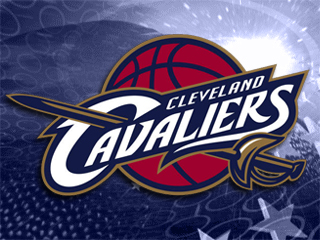
Both Cavs and Kings have swords in their logo. Those are weapons. Promotion of violence. I find that completely offensive and they must be changed immediately.
Offended.
-
05-07-2010, 09:40 PM #12Serious playground baller
- Join Date
- Nov 2009
- Location
- In my home.
- Posts
- 432
Re: Some new NBA logos for the 2010-2011 season
I love the Magic one, looks great.
-
05-07-2010, 09:46 PM #13Next Great White Hope
- Join Date
- Aug 2009
- Location
- Quebec City, Canada
- Posts
- 5,649
Re: Some new NBA logos for the 2010-2011 season
Originally Posted by magnax1
The gray of the Sactown logo is a little bit darker...

The ball in the Clippers logo have been rotated

For the Suns and Bobcats, i think this logo was their second/alternative logo. The primary was the classic one


And for the Cavs, the gold color is brighter
-
05-07-2010, 09:56 PM #14National High School Star
- Join Date
- Mar 2010
- Posts
- 2,041
Re: Some new NBA logos for the 2010-2011 season
I like Orlando's new logo.
Like someone said, their old logo reminds me of the old Shaq days and of the T-Mac days (I was an avid fan of his, and was hurt when he left).
Time for a change, I like it.
-
05-07-2010, 10:18 PM #15Banned
- Join Date
- Oct 2006
- Location
- Mexifornia
- Posts
- 1,887
Re: Some new NBA logos for the 2010-2011 season
GS logo actually looks classy unlike some cheesy azz grizzly bear or a bobcat

 Reply With Quote


